Branding
Brand Identity That Holds Up Beyond the Logo
Positioning, visual identity and voice, documented properly — so your brand stays recognisable whoever is producing the next website, deck or campaign.
- Brand strategy
- Visual identity
- Tone of voice
- Usable guidelines
Brand identity work for businesses ready to look the part
A brand is not a logo. It is the set of decisions that make a company recognisable and consistent — what you stand for, who you are for, how you look, and how you sound.
Without those decisions written down, every new website, deck or campaign restarts the argument. Work drifts, quality depends on who happened to make it, and the company looks smaller and less certain than it is.
We work through positioning first, then build the visual and verbal system that expresses it, and finish with guidelines your team and any future agency can actually follow.
Positioning before aesthetics
What you stand for and who you are for gets settled before anyone draws a mark.
A system, not a single logo
Colour, type, imagery, layout and voice defined together so they work as a whole.
Guidelines people use
Practical documentation with real examples, not a 90-page PDF nobody opens twice.
What We Deliver
Branding capabilities
Strategy, identity and the documentation that keeps both alive after the project closes.
Brand strategy
Positioning, audience definition, value proposition and the competitive space you are actually operating in.
Logo & identity design
A primary mark plus the variants real use demands — stacked, horizontal, monochrome, favicon, small sizes.
Colour systems
Palettes with defined roles and accessible contrast pairings, specified for both screen and print.
Typography systems
Typeface selection and a documented scale, with licensing and web performance considered.
Tone of voice
How the brand sounds in writing, with principles and before-and-after examples people can copy.
Visual language
Photography direction, iconography, graphic devices and layout principles beyond the logo.
Brand applications
Stationery, signage, presentation and social templates showing the identity working in practice.
Brand guidelines
Clear rules on usage, spacing, misuse and application, written for the people who have to follow them.
Rebrands & refreshes
Evolving an existing identity without discarding the recognition you have already built.
Problems We Solve
Signs a brand needs attention
These are the ones that come up most often in a first conversation.
We look smaller than we are
Considered identity system
Consistent, well-executed design is most of what separates an established-looking company from an improvised one.
Everything looks slightly different
Documented brand rules
A defined palette, type scale and usage rules so output stops depending on who made it.
We cannot explain what makes us different
Positioning work
Getting to a clear, defensible statement of who you serve and why they should choose you.
The logo breaks in real use
Full mark family
Variants and clear-space rules for small sizes, dark backgrounds, app icons and embroidery.
We have outgrown the original brand
Considered refresh
Evolving the identity to match where the business is now while keeping what people already recognise.
Why Royal Global
How we approach brand work
Brand work that survives contact with the people who have to use it.
Strategy first, always
We will not present visual routes before positioning is agreed. A mark that looks good but says nothing specific is not worth commissioning.
Shown in real contexts
Identity presented on the things you actually produce — a site header, a proposal, a sign — not floating on a neutral background.
Tested where it will live
Our developers pressure-test the identity in real interfaces, so it does not fall apart on a small screen.
Guidelines built to be used
Short, practical and specific, aimed at whoever produces the next asset rather than at an awards panel.
You own everything
Source files, fonts guidance and full rights handed over. The brand is yours to take anywhere.
How We Work
Our branding process
Collaborative, with decisions made in the open rather than revealed at the end.
- 01
Discovery
Interviews with your team, a look at customers and competitors, and an honest audit of your current materials.
- 02
Positioning
Audience, value proposition and differentiators written down and agreed before any design work begins.
- 03
Identity concepts
A small number of distinct visual routes, each with reasoning, shown in realistic contexts.
- 04
Refinement
One route developed into a complete system: mark family, colour, type, imagery and graphic devices.
- 05
Applications
The identity applied to the pieces you use most, which is where a system's weak points show up.
- 06
Guidelines & handover
Documentation, source files and a walkthrough with the people who will be using the brand day to day.
What You Receive
Your brand package
Everything handed over at the end of an identity project.
Identity assets
- Logo family
- Favicon & app icon
- SVG & PNG exports
- Monochrome versions
System definition
- Colour palette
- Type scale
- Imagery direction
- Icon style
- Layout principles
Documentation
- Brand guidelines
- Tone of voice guide
- Application templates
- Source files
Outcomes
What a documented brand changes
The practical effects of having the decisions made and written down.
Stronger credibility
Coherent presentation makes a company read as established, which matters most before anyone has met you.
Recognition that compounds
Consistent colour, type and voice mean each piece of marketing reinforces the last instead of starting over.
Faster decisions
Most design debates end quickly once there is an agreed rule to point at.
Easier onboarding
New staff and new agencies can produce on-brand work without absorbing it by osmosis.
Sharper messaging
Positioning work usually improves how your team talks about the business, not just how it looks.
A base for everything after
Websites, campaigns and collateral all get cheaper and more consistent once the system exists.
Related Work
Branding in practice
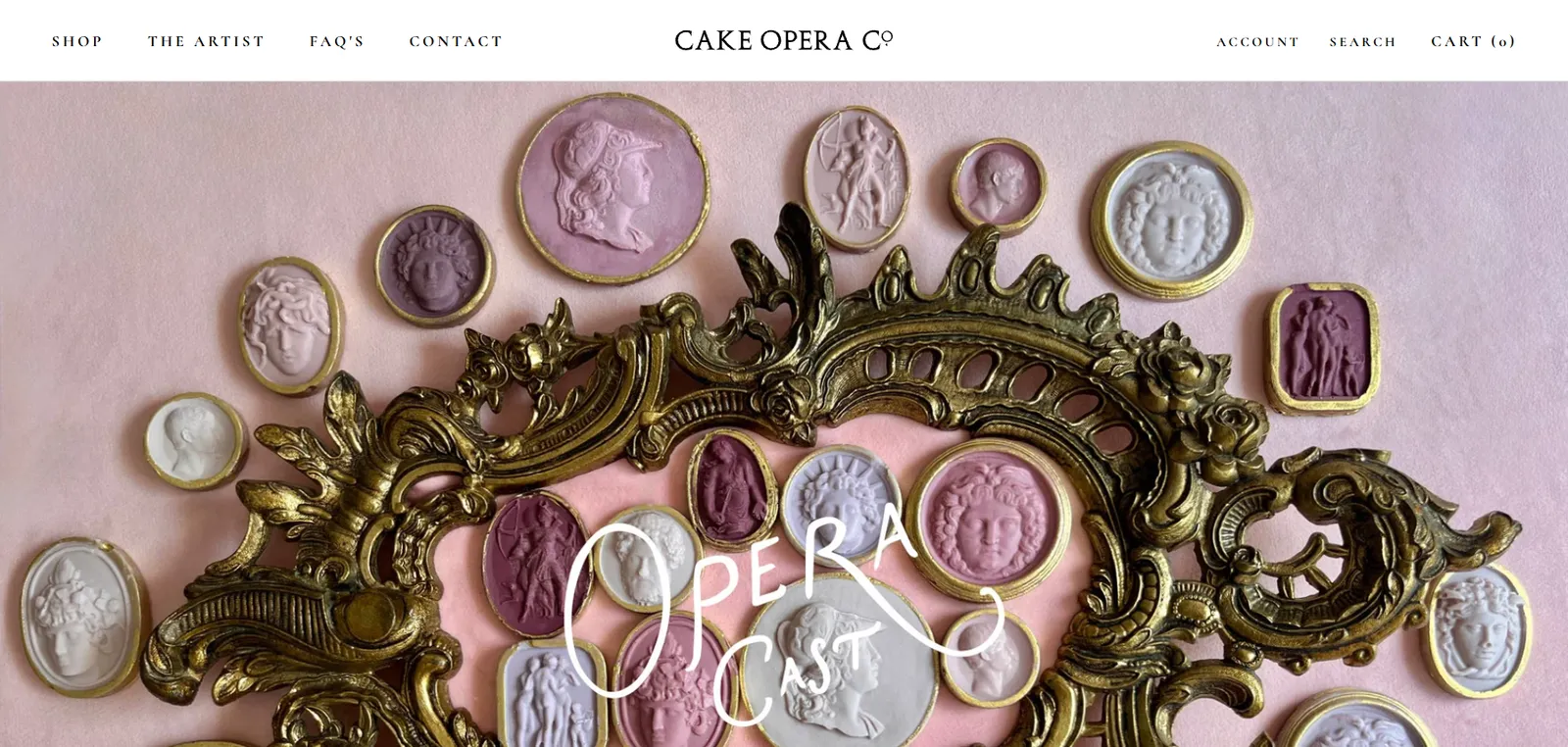
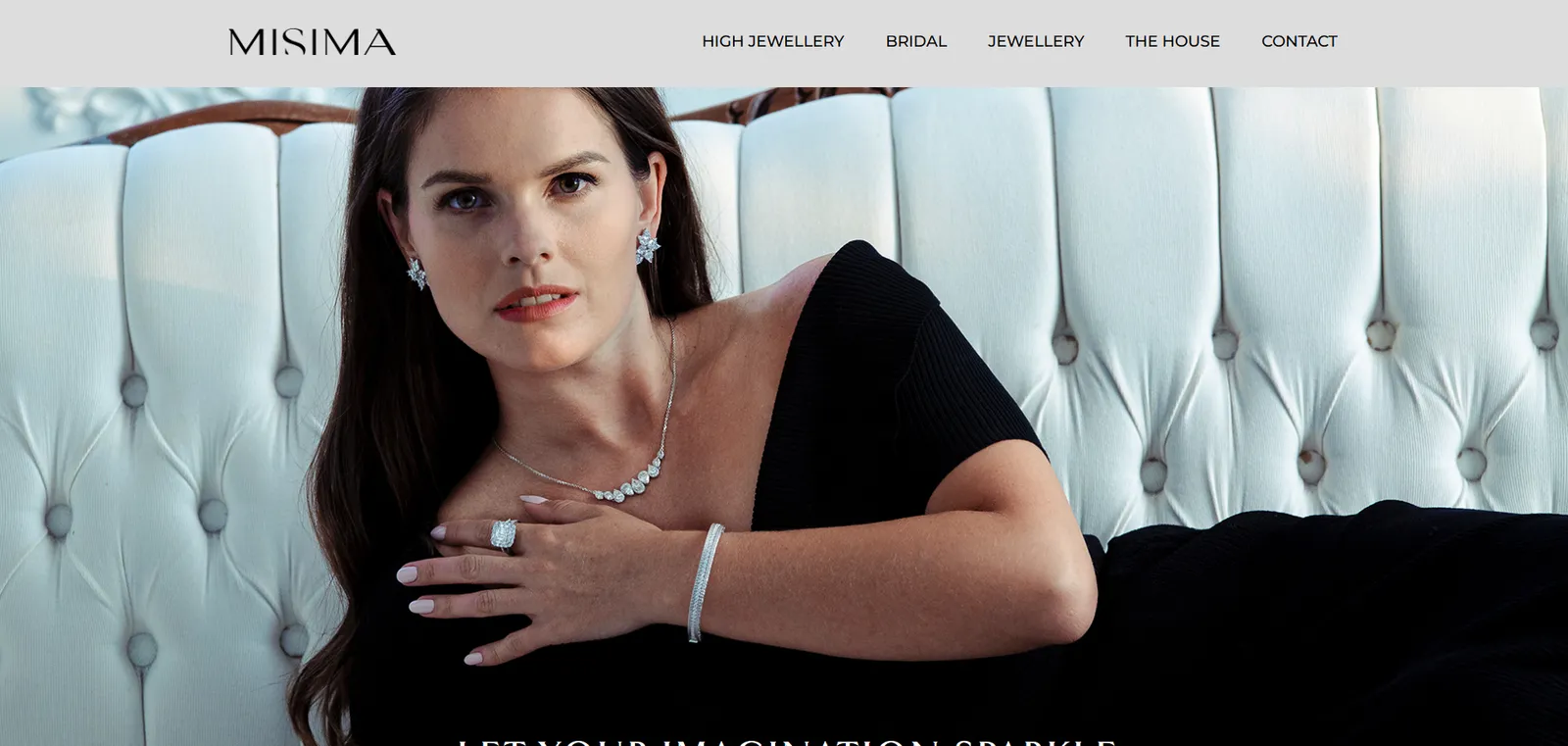
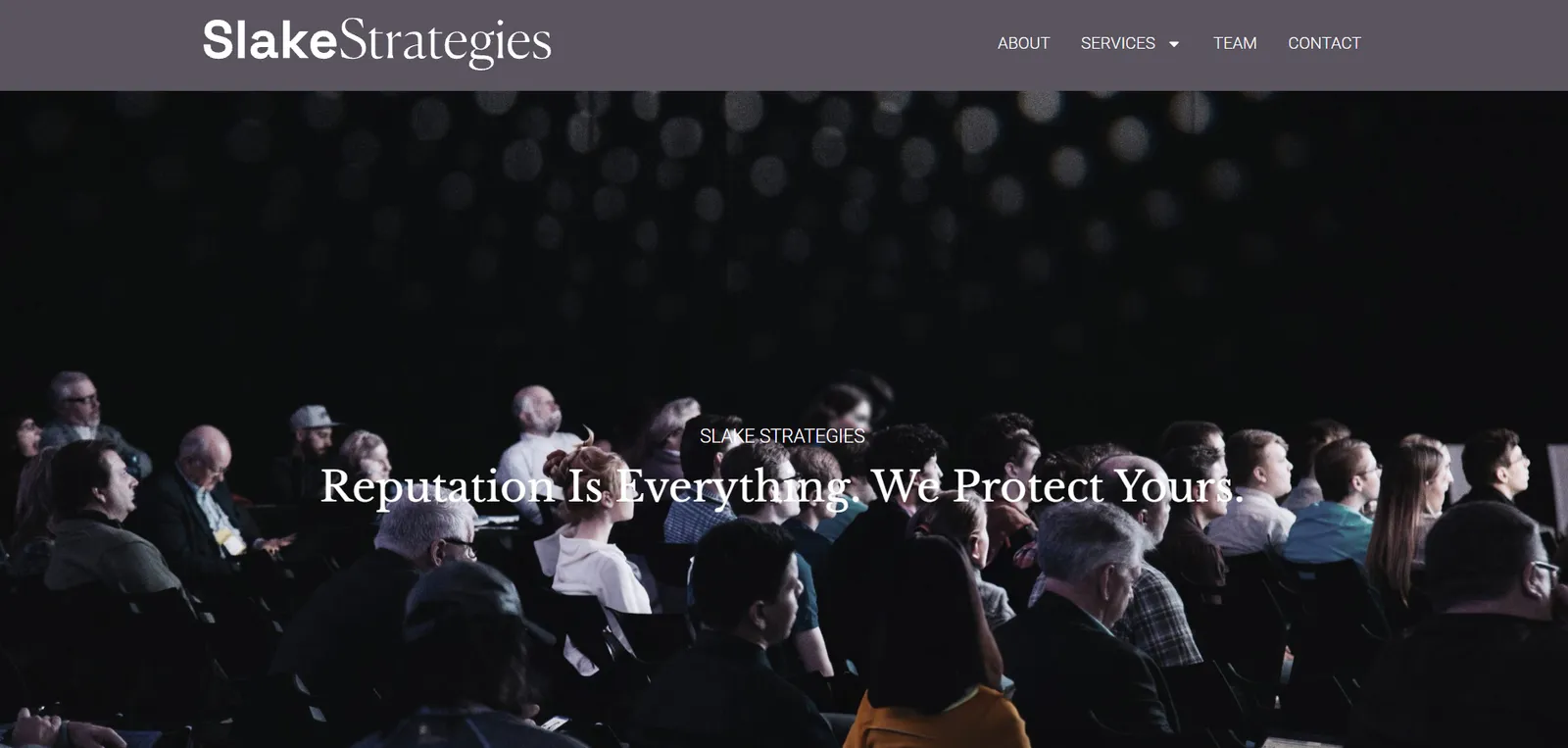
Live client sites we designed and built. Each one looks like its own brand, not like ours.
Understanding brand identity work
What a branding engagement covers, and how to judge whether you need one.
Brand, identity and logo are not the same thing
A logo is a mark. A visual identity is the wider system — colour, type, imagery, layout — that the mark sits within. A brand is broader still: the position you occupy and the impression you leave, including things design never touches.
Commissioning a logo alone rarely solves the underlying problem, because the inconsistency usually lives in everything around it.
Why positioning has to come first
Design decisions need something to be right about. Without an agreed position, feedback collapses into personal preference and the process stalls.
Once you can state who you serve, what you do differently and what you want to be known for, evaluating a visual route becomes straightforward: does it support that, or not?
What belongs in brand guidelines
Useful guidelines cover logo variants and clear space, the colour palette with accessible pairings, the type scale, imagery direction, and examples of correct and incorrect use.
Length is not a virtue. A focused document people actually consult beats a comprehensive one that gets filed and forgotten.
Rebrand or refresh?
A refresh keeps the recognisable core and modernises execution — usually right when the business has not fundamentally changed but the materials have aged.
A full rebrand makes sense after a merger, a significant change of direction, or where the existing identity actively misrepresents what you now do. It costs more and it discards existing recognition, so it should be a deliberate choice rather than a default.
Designing an identity for digital first
Most people will meet your brand on a phone. A mark that only works large, a palette that fails contrast requirements, or a typeface that loads slowly will cause problems immediately.
We check identities at favicon size, on dark backgrounds, against accessibility contrast ratios and for web font performance — before the guidelines are finalised rather than after.
Tone of voice is part of the brand
Two companies can share a colour palette and sound nothing alike. Voice covers vocabulary, sentence length, formality and what you refuse to say.
Documented with real before-and-after examples, it is one of the most immediately useful parts of a brand system — particularly for teams where several people write customer-facing copy.
Common Questions
Frequently asked questions
What is included in a branding project?
Typically brand strategy and positioning, logo and identity design, colour and typography systems, tone of voice, key applications and a guidelines document, plus all source files. The exact scope is agreed before we start so you know what you are receiving.
Do you only design logos?
We can, but we usually advise against a logo in isolation. Without an agreed position and a wider system, a new mark tends to sit awkwardly beside materials that were not designed for it.
How long does a branding project take?
A focused identity project generally runs several weeks; a full strategy-led brand programme with extensive applications takes longer. Stakeholder availability for discovery and reviews is usually the main variable.
Do we own the brand assets outright?
Yes. Full rights and source files are transferred to you on completion. You can take the brand to any other agency or handle it internally without needing our involvement.
Can you refresh our brand without starting over?
Often that is the better option. A refresh keeps the elements customers already recognise and modernises the rest, which costs less and protects the equity you have built.
Will the brand work in print as well as online?
Yes. Colour is specified for both screen and print, the logo is supplied in vector format for any size, and we check the mark at small sizes and in single colour for applications like embroidery or signage.
Do you help with naming?
We can support naming as part of a wider brand project, including generating and screening candidates. We are not a trademark practice, so we will always recommend you have shortlisted names checked by a professional before committing.
What if our team disagrees about direction?
That is common and usually a sign positioning was not settled first. Our process front-loads that agreement, so later reviews are judged against agreed criteria rather than individual taste.
Let's Talk
Is your brand keeping up with your business?
Tell us where the current identity is letting you down. We will give you an honest view on whether that needs a refresh, a rebrand, or just better documentation.