UI/UX Design
Interfaces Designed Around How People Actually Behave
We map the journey, test the assumptions and design screens that remove friction — so visitors understand what you offer and know what to do next without thinking about it.
- User research
- Wireframing
- Interactive prototypes
- Design systems
User experience design that earns its place
Good interface design is mostly subtraction. Every element competing for attention makes the important one harder to see, and every extra field is another chance for someone to abandon the form.
We work out what a visitor is trying to achieve, what stands in their way, and what evidence they need before they will act. Then we design the shortest honest path between those points.
Design decisions get validated while they are still cheap to change — in a wireframe or a clickable prototype rather than after development has started. That is usually the difference between a redesign that works and one that just looks different.
Journeys before screens
We map how people arrive, what they compare and where they hesitate before drawing a single layout.
Tested before it is built
Prototypes get reviewed and clicked through, so problems surface at the cheapest possible moment.
Systems, not one-off pages
Reusable components and rules so the design holds together as the product grows.
What We Do
UI/UX design capabilities
Research through to handoff, with as much or as little of the middle as your project needs.
User research
Interviews, analytics review and competitor analysis to establish what people need rather than what we assume.
Journey mapping
Charting the route from first contact to conversion, and identifying where people currently drop out.
Information architecture
Structuring content and navigation so finding things takes one guess, not three.
Wireframing
Low-fidelity layouts that settle hierarchy and flow before visual design enters the conversation.
Interface design
High-fidelity screens with considered typography, spacing, colour and state handling.
Interactive prototyping
Clickable prototypes you can put in front of real users or stakeholders before committing to code.
Design systems
Component libraries, tokens and usage rules that keep future work consistent and faster to produce.
Accessibility review
Contrast, focus states, keyboard paths and semantics checked against WCAG at design stage.
Developer handoff
Specs, tokens and annotated states so what gets built matches what was designed.
Problems We Solve
Symptoms that point to a design problem
These usually get blamed on traffic or copy. More often the interface is the cause.
High traffic, few enquiries
Conversion path redesign
Clarifying the primary action per page and removing the competing elements that dilute it.
People cannot find what they need
Information architecture rework
Restructuring navigation and labels around how your audience describes things, not your internal org chart.
Forms get started but not finished
Form simplification
Cutting optional fields, splitting long forms into steps and making errors recoverable rather than punishing.
The product feels inconsistent
Design system
One set of components and rules so every screen behaves the same way and new pages are quicker to build.
Mobile feels like an afterthought
Mobile-first interface design
Designing the narrow layout first, which forces the hard prioritisation decisions early.
Why Royal Global
How we approach design work
Design that can be defended with reasons, not just presented as taste.
Every decision has a reason
We can tell you why a button sits where it does and what problem it solves. If we cannot justify an element, it should not be there.
Designed to be buildable
Our designers and developers work together, so nothing gets designed that quietly becomes expensive to build.
Accessible by default
Contrast, focus and keyboard access are design constraints from the start, not a remediation project later.
Iterative, not a big reveal
You see and shape the work throughout rather than receiving a finished design to react to.
Built to extend
Components and tokens that make the tenth screen faster to design than the first.
How We Work
Our design process
Each stage produces something concrete you can react to.
- 01
Research
Stakeholder interviews, analytics review and competitor teardown to understand the audience and the current friction.
- 02
Define
Journeys, priorities and success criteria agreed in writing, so the design has something to be measured against.
- 03
Structure
Information architecture and wireframes establishing hierarchy and flow without visual distraction.
- 04
Design
High-fidelity interfaces including empty, loading, error and success states — not just the happy path.
- 05
Prototype & validate
Clickable prototypes reviewed with stakeholders or users, with findings folded back into the design.
- 06
Systemise & hand off
Components, tokens and documentation packaged so developers can build it accurately.
Tools & Methods
How we work day to day
Standard tooling, chosen so your team can pick the files up if you ever move the work in-house.
Design
- Figma
- Design tokens
- Component libraries
- Prototyping
Research
- Stakeholder interviews
- Analytics review
- Heuristic evaluation
- Usability testing
Standards
- WCAG 2.2
- Responsive breakpoints
- State documentation
- Handoff specs
Outcomes
What better interface design changes
The structural effects of clearer design — no conversion percentages invented here.
Clearer next steps
Visitors can tell what you want them to do, which is most of what a conversion path is.
Less hesitation
Fewer competing options and clearer labels mean less time spent deciding and more spent acting.
Wider access
Accessible design serves people using assistive technology and everyone on a bad screen in bright sun.
Faster future work
A design system turns each new page from a blank canvas into an assembly job.
Fewer support questions
Interfaces that explain themselves generate fewer emails asking how something works.
Cheaper development
Decisions settled in a prototype cost a fraction of the same decisions made mid-build.
Related Work
UI/UX Design in practice
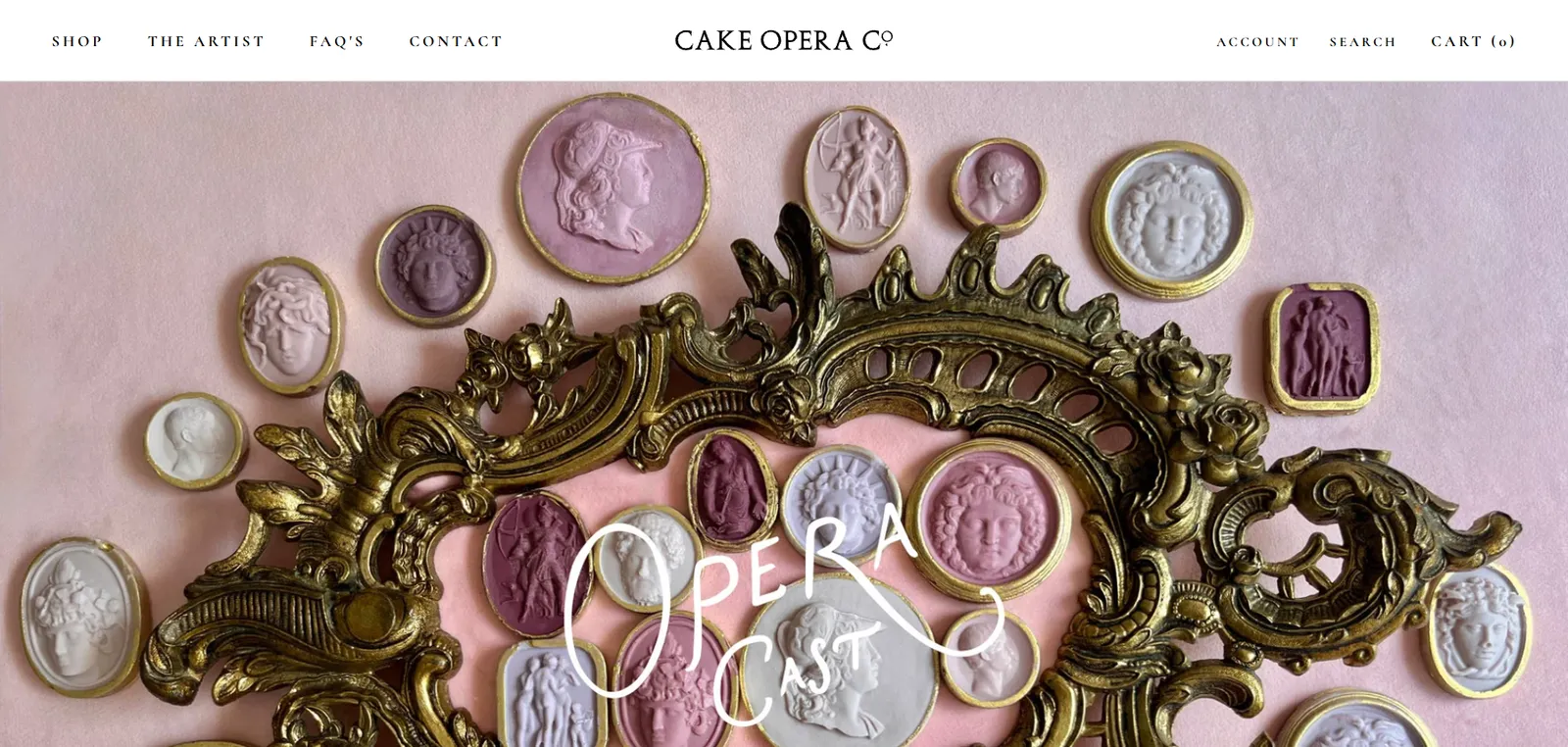
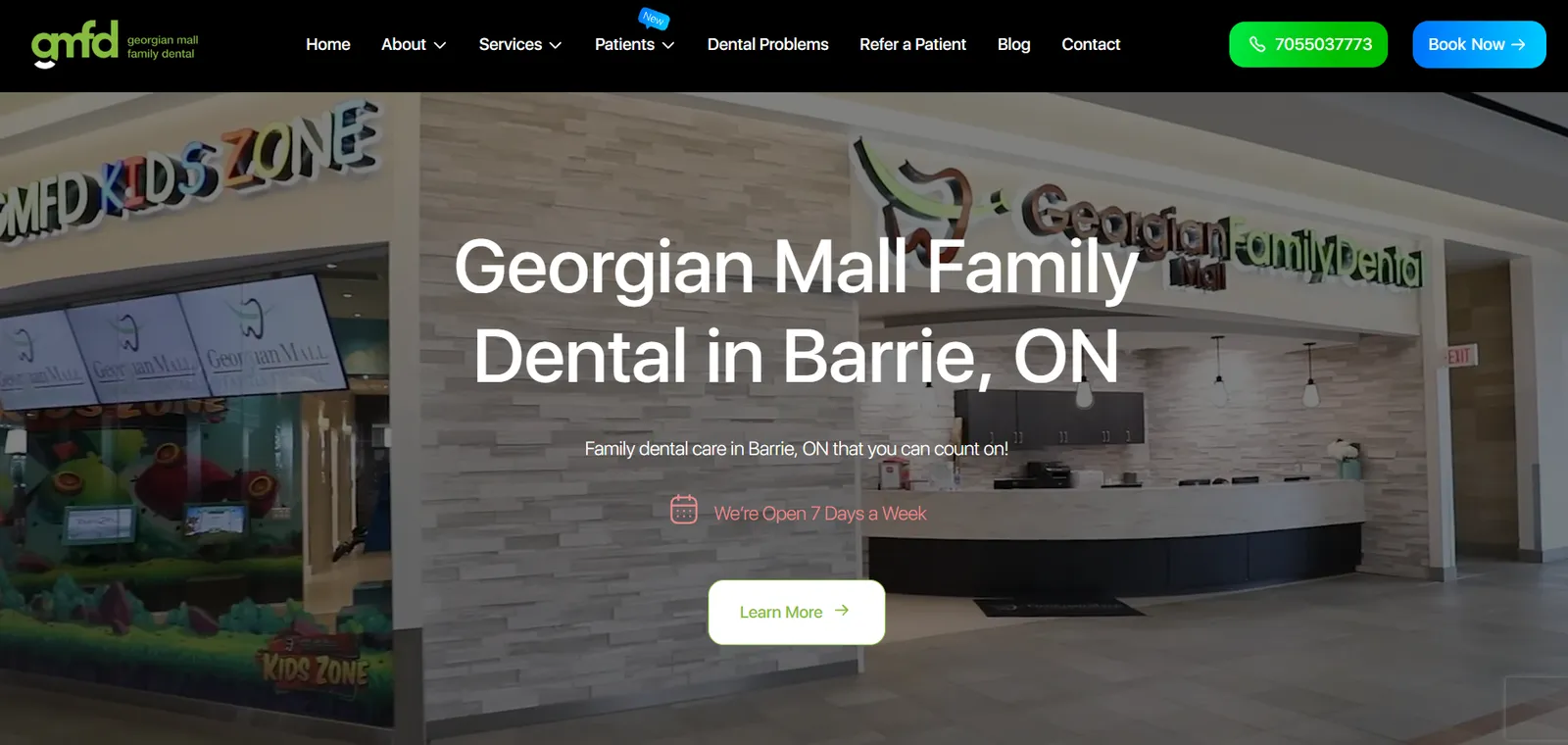
Live client sites we designed and built. Each one looks like its own brand, not like ours.

Understanding UI and UX design
What the terms actually mean, and what to expect from a design engagement.
The difference between UI and UX
UX is the shape of the experience: what steps exist, in what order, and what information is needed at each one. UI is the surface: typography, colour, spacing, components and states.
Both matter, and they fail differently. Weak UX means people cannot achieve what they came for. Weak UI means they can, but it feels unconvincing — which for a business site often costs you the enquiry anyway.
Why research changes the outcome
Teams are too close to their own product to judge it. Internal language leaks into navigation, and assumptions about what is obvious go untested.
Even lightweight research — reviewing analytics, watching a handful of people attempt a task — reliably surfaces problems nobody internally had noticed. It does not need to be expensive to be worth doing.
What a design system is for
A design system is a documented set of components and rules: how buttons behave, what spacing steps exist, which type sizes are permitted, how errors appear.
The benefit is compounding. The first few screens take slightly longer, then every screen after that is faster to design and build, and consistency stops depending on whether everyone remembers the convention.
Designing for accessibility
Accessibility is largely a design responsibility. Colour contrast, focus indicators, touch target size, logical heading order and clear labelling are all decided before code exists.
It also improves the experience generally. Larger tap targets and stronger contrast help everyone, particularly on mobile devices in imperfect conditions.
Prototypes versus finished design
A prototype is for answering questions: can someone complete this task, is this label understood, does this order make sense. It deliberately looks unfinished so feedback stays on structure.
Moving to high fidelity too early tends to derail reviews into debates about colour while a flow problem goes unnoticed. Sequencing the two properly is part of why the process works.
How design and development fit together
Designs that ignore implementation cost get compromised during the build, usually by whoever is closest to the deadline. That is how inconsistency creeps in.
We keep designers and developers in the same conversation, so feasibility is considered as designs are made and handoff includes the states and edge cases developers actually need.
Common Questions
Frequently asked questions
What is the difference between UI and UX design?
UX design covers the structure of the experience — the journey, the steps and what information appears when. UI design covers the visual surface: layout, typography, colour, components and interaction states. Most projects need both, and we scope them together unless you only need one.
Do I need UX design if I already have a developer?
If the developer is also making layout and flow decisions, they are doing UX design whether or not it is named that. Separating the two means those decisions get made deliberately and reviewed before they are expensive to change.
What do you deliver at the end of a design project?
Typically wireframes, high-fidelity screens covering the key states, a clickable prototype, and a component library with specifications for handoff. The exact deliverables are agreed during scoping so you know what you are receiving.
Do you do user testing?
Where the budget and timeline allow, yes — even testing with a small number of people reliably finds issues. Where it does not, we use analytics review and heuristic evaluation, and we will be clear about which level of validation your project is getting.
Can you redesign an existing product without starting over?
Often, yes. We can work through the highest-impact screens first and introduce a design system gradually, which spreads cost and reduces risk compared with a full rebuild.
Do you design in Figma?
Yes. Figma is our main design tool, and you get access to the files. If you later move design in-house or to another partner, the work goes with you.
Will the designs be accessible?
We design against WCAG 2.2 AA as a baseline — contrast ratios, focus states, keyboard paths, target sizes and semantic structure. Accessibility findings that need development work are flagged at handoff.
How long does a design project take?
A focused marketing site design is usually a few weeks; a larger product with many states and a design system takes longer. Research depth and review turnaround are the main variables, and we agree both at the start.
Let's Talk
Is your interface getting in the way?
Tell us where visitors are dropping off or hesitating. We will look at the journey and come back with what we would change and why.